테마의 설정을 바꿔주는 Style Settings 플러그인
개요
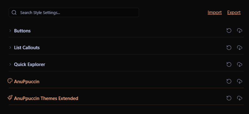
Style Settings 플러그인은 테마와 일부 플러그인의 시각적 요소를 사용자 정의할 수 있는 기능을 제공합니다. 이 플러그인의 강력한 커스터마이징 기능을 활용하여 개인적인 작업 환경을 더욱 세밀하게 조정할 수 있게 해줍니다.
| 플러그인 명 | Style Settings |
| 플러그인 설명 | 테마와 일부 플러그인의 시각적 요소를 사용자 정의 |
| 플러그인 분류 | 설정 관리, 스타일 설정 |
| Github 링크 | Github 링크 |
| 옵시디언 링크 | 플러그인 링크 |
| 별점 | ⭐⭐ |
주요 기능
- 테마별 조정: 사용 중인 테마의 폰트 크기, 색상, 여백 등 다양한 시각적 요소를 사용자의 취향에 맞게 조정할 수 있습니다.
- 플러그인 조정: 플러그인의 시각적 요소도 Style Settings를 통해 조정할 수 있습니다.
사용자 설정 기능
/* @settings

name: Your Section Name Here
id: a-unique-id
settings:
    -
        id: my-title
        title: My Settings
        type: heading
        level: 3
    -
        id: accent
        title: Accent Color
        type: variable-color
        format: hsl-split
        default: '#007AFF'
    -
        id: text
        title: UI font
        description: Font used for the user interface
        type: variable-text
        default: -apple-system, BlinkMacSystemFont, "Segoe UI", Roboto, Oxygen-Sans, Ubuntu, Cantarell, "Helvetica Neue", sans-serif

*/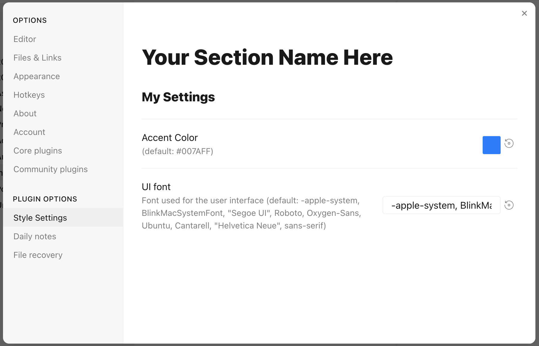
사용자 설정을 만들 수 있습니다. CSS snippets 을 대신할 수 있는 인테페이스 기능입니다.
매개 변수
id: 설정 매개변수의 고유 식별자title: 이름description: 설정에 대한 설명typeheading: 스타일 그룹화, 그룹화 제목class-toggle: CSS 클라스 전환 토글class-select: 드롭다운 메뉴 클래스variable-text: 텍스트variable-number: 숫자 CSS 변수, 글꼴 크기, 글꼴 두께 등에 사용variable-number-slider: 슬라이더로 표시되는 숫자 CSS 변수variable-select: 드롭다운 메뉴로 표시되는 텍스트 CSS 변수variable-color: #FFFFFF와 같은 색상 선택기가 있는 색상 CSS 변수
Type
heading
heading은 설정을 접을 수 있는 섹션으로 조직하고 그룹화하는 데 사용될 수 있습니다. 필수 속성들과 함께, heading은 1에서 6 사이의 level 속성을 반드시 포함해야 하며, 선택적으로 collapsed 속성을 포함할 수 있습니다:
/* @settings

name: Your Section Name Here
id: a-unique-id
settings:
    -
        id: this-is-a-heading
        title: My Heading
        type: heading
        level: 2
        collapsed: true

*/
info-text
info-text는 사용자에게 임의의 정보 텍스트를 표시합니다. description은 markdown이 true로 설정된 경우 마크다운을 포함할 수 있습니다.
/* @settings

name: Your Section Name Here
id: a-unique-id
settings:
    -
        id: my-info-text
        title: Information
        description: "This is *informational* text"
        type: info-text
        markdown: true

*/
class-toggle
class-toggle은 body 요소에 CSS 클래스를 켜고 끌 수 있게 해주며, CSS 테마와 스니펫이 기능을 켜고 끌 수 있도록 합니다. 설정의 id는 클래스 이름으로 사용됩니다. default 매개변수는 선택적으로 true로 설정될 수 있습니다. class-toggle은 또한 addCommand 속성을 지원합니다. true로 설정되면, 단축키나 명령어 팔레트를 통해 클래스를 토글할 수 있는 명령이 obsidian에 추가됩니다.
/* @settings

name: Your Section Name Here
id: a-unique-id
settings:
    -
        id: my-css-class
        title: My Toggle
        description: Adds my-css-class to the body element
        type: class-toggle

*/
class-select
class-select은 CSS 변수에 대한 사전 정의된 옵션의 드롭다운을 생성합니다. 설정의 id는 변수 이름으로 사용됩니다.
allowEmpty가false인 경우,default옵션을 반드시 지정해야 합니다.allowEmpty가true인 경우,default속성은 선택 사항이며,none으로 설정될 수 있습니다.
/* @settings

name: Your Section Name Here
id: a-unique-id
settings:
    -
        id: theme-variant
        title: Theme variant
        description: Variations on a theme
        type: class-select
        allowEmpty: false
        default: my-class
        options:
            - my-class
            - my-other-class
            - and-yet-another

*/
옵션에는 레이블도 지정될 수 있습니다.
/* @settings

name: Your Section Name Here
id: a-unique-id
settings:
    -
        id: theme-variant
        title: Theme variant
        description: Variations on a theme
        type: class-select
        allowEmpty: false
        default: my-class
        options:
            -
                label: My Class
                value: my-class
            -
                label: My Other Class
                value: my-other-class
*/
variable-text
variable-text는 텍스트 기반 CSS 값을 나타냅니다. 설정의 id는 변수 이름으로 사용됩니다. 출력은 quotes가 true로 설정된 경우 따옴표로 감싸집니다. variable-text 설정에는 default 속성이 필요합니다.
/* @settings

name: Your Section Name Here
id: a-unique-id
settings:
    -
        id: text
        title: UI font
        description: Font used for the user interface
        type: variable-text
        default: -apple-system, BlinkMacSystemFont, "Segoe UI", Roboto, Oxygen-Sans, Ubuntu, Cantarell, "Helvetica Neue", sans-serif

*/
CSS에는 다음처럼 출력됩니다.
--text: -apple-system, BlinkMacSystemFont, "Segoe UI", Roboto, Oxygen-Sans, Ubuntu, Cantarell, "Helvetica Neue", sans-serif;quotes 사용:
/* @settings

name: Your Section Name Here
id: a-unique-id
settings:
    -
        id: icon
        title: Bullet Icon
        description: Text used in bullet points
        type: variable-text
        default: •
        quotes: true
*/
CSS에는 다음처럼 출력됩니다.
--icon: '•'variable-number
variable-number는 숫자 기반 CSS 값을 나타냅니다. 설정의 id는 변수 이름으로 사용됩니다. variable-number 설정에는 default 속성이 필요하며, 선택적으로 format 속성을 설정할 수 있습니다. 이 값은 숫자에 추가됩니다. 예를 들어, format: px는 42px을 결과로 합니다.
/* @settings

name: Your Section Name Here
id: a-unique-id
settings:
    -
        id: line-width
        title: Line width
        description: The maximum line width in rem units
        type: variable-number
        default: 42
        format: rem

*/
CSS에는 다음처럼 출력됩니다.
--line-width: 42rem;variable-number-slider
variable-number-slider는 숫자 기반 CSS 값을 나타냅니다. 설정의 id는 변수 이름으로 사용됩니다. variable-number-slider 설정에는 default 속성이 필요하며, 다음 세 가지 속성도 필요합니다:
min: 슬라이더의 최소 가능 값max: 슬라이더의 최대 가능 값step: 슬라이더의 "틱" 크기. 예를 들어, 100의 단계는 슬라이더가 100의 증분으로만 이동할 수 있음을 의미합니다.
선택적으로 format 속성을 설정할 수 있습니다. 이 값은 숫자에 추가됩니다.
/* @settings

name: Your Section Name Here
id: a-unique-id
settings:
    -
        id: line-width
        title: Line width
        description: The maximum line width in rem units
        type: variable-number-slider
        default: 42
        min: 10
        max: 100
        step: 1

*/
CSS에는 다음처럼 출력됩니다.
--line-width: 42;variable-select
variable-select는 CSS 변수에 대한 사전 정의된 옵션의 드롭다운을 생성합니다. 설정의 id는 변수 이름으로 사용됩니다. variable-select 설정에는 default 속성과 옵션 목록이 필요합니다.
/* @settings

name: Your Section Name Here
id: a-unique-id
settings:
    -
        id: text
        title: UI font
        description: Font used for the user interface
        type: variable-select
        default: Roboto
        options:
            - Roboto
            - Helvetica Neue
            - sans-serif
            - Segoe UI

*/
옵션에는 선택적으로 레이블을 지정할 수 있습니다.
/* @settings

name: Your Section Name Here
id: a-unique-id
settings:
    -
        id: text
        title: UI font
        description: Font used for the user interface
        type: variable-select
        default: Roboto
        options:
            -
                label: The best font
                value: Roboto
            -
                label: The next best font
                value: Helvetica Neue
*/
CSS에는 다음처럼 출력됩니다.
--text: Roboto;variable-color
variable-color는 다양한 출력 형식 옵션을 가진 색상 선택기를 생성합니다. default 속성은 hex 또는 rgb 형식으로 필요하며, format 속성도 필요합니다.
선택적 매개변수:
opacity를true로 설정하면 모든 출력 형식에서 불투명도 지원이 활성화됩니다.alt-format설정을 통해 대체 출력 형식 목록을 제공할 수 있습니다.
/* @settings

name: Your Section Name Here
id: a-unique-id
settings:
    -
        id: accent
        title: Accent Color
        type: variable-color
        opacity: false
        format: hex
        alt-format:
            -
                id: accent-rgb
                format: rgb
        default: '#007AFF'

*/
CSS에는 다음처럼 출력됩니다.
--accent: #007AFF;
--accent-rgb: rgb(0, 123, 255);
variable-themed-color
variable-themed-color는 variable-color와 동일하지만, 밝은 및 어두운 변형에 대해 두 개의 색상 선택기를 생성합니다.
/* @settings

name: Your Section Name Here
id: a-unique-id
settings:
    -
        id: accent
        title: Accent Color
        type: variable-themed-color
        format: hex
        opacity: false
        default-light: '#007AFF'
        default-dark: '#2DB253'

*/
CSS에는 다음처럼 출력됩니다.
body.theme-light.css-settings-manager { --accent: #007AFF; }
body.theme-dark.css-settings-manager { --accent: #2DB253; }
variable-color 포맷 옵션
8가지 서식 옵션이 있습니다:
hex
--accent: #007AFF;opacity가 true로 설정된 경우:
--accent: #007AFFFF;rgb
--accent: rgb(0, 122, 255);opacity가 true로 설정된 경우:
--accent: rgba(0, 122, 255, 1);rgb-values
--accent: 0, 122, 255;opacity가 true로 설정된 경우:
--accent: 0, 122, 255, 1;rgb-split
--accent-r: 0;
--accent-g: 122;
--accent-b: 255;opacity가 true로 설정된 경우:
--accent-r: 0;
--accent-g: 122;
--accent-b: 255;
--accent-a: 1;
hsl
--accent: hsl(211, 100%, 50%);opacity가 true로 설정된 경우:
--accent: hsla(211, 100%, 50%, 1);hsl-values
--accent: 211, 100%, 50%;opacity가 true로 설정된 경우:
--accent: 211, 100%, 50%, 1;hsl-split
--accent-h: 211;
--accent-s: 100%;
--accent-l: 50%;opacity가 true로 설정된 경우:
--accent-h: 211;
--accent-s: 100%;
--accent-l: 50%;
--accent-a: 1;
hsl-split-decimal
--accent-h: 211;
--accent-s: 1;
--accent-l: 0.5;opacity가 true로 설정된 경우:
--accent-h: 211;
--accent-s: 1;
--accent-l: 0.5;
--accent-a: 1;
color-gradient
color-gradient는 두 개의 존재하는 색상 변수 사이의 그라데이션을 따라 고정된 수의 색상을 출력합니다. format 속성도 필요합니다. 주의: 그라데이션을 생성하기 위해서는 스타일 설정 id 아래에 정의된 색상을 사용해야 합니다.
매개변수:
from: 시작 색상, 또는 0단계에서의 색상to: 끝 색상, 또는 100단계에서의 색상step: CSS 변수를 출력할 증분. 예를 들어,step을10으로 설정하면--var-0,--var-10,--var-20등이 출력됩니다.format:hsl,rgb, 또는hex중 하나일 수 있습니다.pad?: 설정된 경우, 변수의 숫자 부분이 이 숫자의 자릿수를 포함할 때까지0으로 채워집니다. 예를 들어,pad를3으로 설정하고step을10으로 설정하면--var-000,--var-010,--var-020등이 출력됩니다.
/* @settings

name: Your Section Name Here
id: a-unique-id
settings:
    -
        id: color-base
        type: color-gradient
        from: color-base-00
        to: color-base-100
        step: 5
        pad: 2
        format: hex

*/
Plugin Support
플러그인은 플러그인의 CSS에서 스타일 설정 구성을 지정할 수 있습니다. 플러그인이 로드될 때 스타일 설정이 CSS 변경 사항을 인지하도록 하기 위해 플러그인은 app.workspace.trigger("parse-style-settings")를 호출해야 합니다.
Localization Support
Obsidian이 지원하는 각 언어에 대한 제목과 설명의 번역은 다음과 같은 후미사를 사용하여 제공될 수 있습니다:
en: English
zh: 简体中文
zh-TW: 繁體中文
ru: Pусский
ko: 한국어
it: Italiano
id: Bahasa Indonesia
ro: Română
pt-BR: Portugues do Brasil
cz: čeština
de: Deutsch
es: Español
fr: Français
no: Norsk
pl: język polski
pt: Português
ja: 日本語
da: Dansk
uk: Український
sq: Shqip
tr: Türkçe (kısmi)
hi: हिन्दी (आंशिक)
nl: Nederlands (gedeeltelijk)
ar: العربية (جزئي)
예시:
/* @settings

name: Your Section Name Here
id: a-unique-id
settings:
    -
        id: my-css-class
        title: My Toggle
        title.de: Mein Toggle
        title.ko: 내 토글
        description: Adds my-css-class to the body element
        description.de: Fügt my-css-class zum body-Element hinzu
        description.ko: my-css-class를 body 요소에 추가합니다.
        type: class-toggle

*/
'옵시디언 플러그인 > 커뮤니티 플러그인' 카테고리의 다른 글
| 설정에서 검색을 할 수 있는 Settings Search 플러그인 (0) | 2024.02.03 |
|---|---|
| 단축키 설정을 그래픽으로 표시하는 Keyboard Analyzer 플러그인 (0) | 2024.02.03 |
| Paste 기능을 향상시키는 Paste Mode 플러그인 (0) | 2024.02.03 |
| 노트에 목차(TOC)를 생성해주는 Automatic Table Of Contents 플러그인 (1) | 2024.02.03 |
| 아웃라인 작성을 편하게 Outliner 플러그인 (3) | 2024.02.03 |